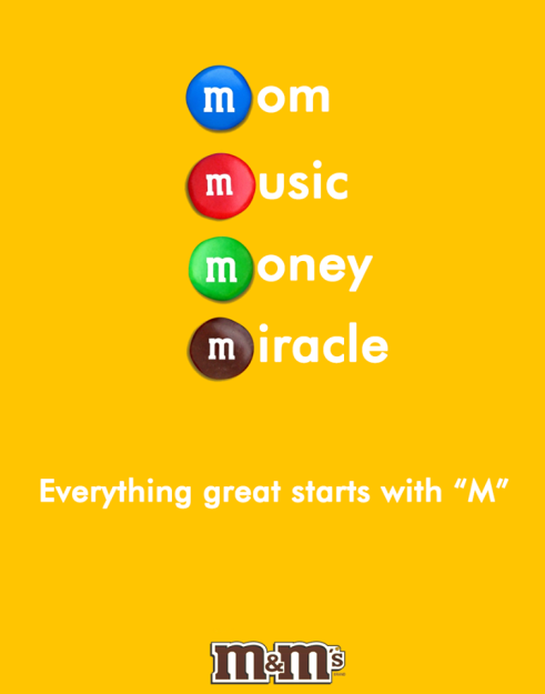
Just over a year ago a Georgia gentleman by the name of Solomon Tsitsuashvili, owner of Solomon’s Copy Shop, set out on a mission to create 365 print ads. He did this by creating one ad every day for a whole year. After creating the ads he uploaded them to his Facebook page for others to see. I chose one of his ads not realizing that it was not an actual ad for M&M’s. None the less it is still great and it helps us see the design principles we have been learning about.
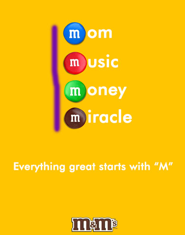
Contrast
The contrast of the white letters on yellow makes it easier to read and the brown M&M logo really stands out at the bottom since it is mounted on white and then yellow.
Repetition
The m’s on the candy and in the logo are the same font and repeated over and over.
Color
The use of the colored candy is noticeable right away, and if you have ever eaten an M&M you know what they are advertising without even reading the rest of the ad. The yellow background is also a great choice because of it’s brightness, you would see it easily.
Alignment
The M&M candies are all left aligned in the middle of the page drawing your eye to see them immediately.
Proximity
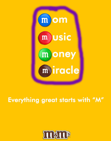
The proximity of the candies all grouped together and at the top part of the page makes it easy to read and follow to the next area with the tagline.
